Wednesday 30 January 2013

Font tests
So I've been messing around with a few fonts and colours for the name of my magazine. Here are the outcomes.
I printed off my font tests and went round asking others of their favourite fonts. I came back with two most popular fonts.
 
The first being, the red thin font just because it's simple and straight forward in terms of my genre as it will be strictly folk music. However the colour they said should be changed to a more orangey/blue/ green colour to represent the genre 'folk'.
The second most popular font was the orange thick font, this being because when being placed on the magazine it won't be lost, so not only will it be easy for the target audience to spot but it won't get lost within the picture being used.
 

Tuesday 29 January 2013

SHOTLIST
First off let me apologize for the delay of my shot list, I couldn't find it but I have finally found it and it is now ready for me to display to you lovely people. Again I apologize for the delay.
 
 
Planning for the interview.
29/01/2013
In today's lesson we went through, what questions we should ask/ how we should word these particular questions and what it is we should aim to ask. 

• What do your readers already know about the artist?
• What do your readers want to know more about?
• What is the artist best known for/ what do you they want to be known for?
• What are you going to try and find out about the artist? 

From these questions, I have produced four main questions that I plan to ask my artist which are;
  1. If you could describe yourself in three words which words would you use?
  2. So, Toby why music? Why not art or drama. What is it about music that completely reeled and captured you in?
  3. The music that you produce is there someone there in the back of your mind. A lover by any chance?
  4. When describing your genre what would you consider your music to come under? Do you think you’re similar to any artist out there (currently)...?

Sunday 27 January 2013

Distribution of my magazine... 27/01/2013
Hope you enjoy the video!


Feed back on flat plans
On the Tuesday 22nd of January 2013 I received feedback on my flatplans.
Feedback received;
  1. The price of the magazine is a bit off, needs to go over conventions.
  2. Double page spread should have a more structured layout.
  3. Move eye catching masthead on double page spread.
What I have decided to do is take this feedback and produce a new flat plan for my double page spread; and be more creative. Also for the front cover, I am going to try and replace the position of the price and change the price to make it look more like a monthly magazine.

Saturday 26 January 2013

Friday 25th January 2013
So yesterday I again took a few more shots for my magazine, and played around with the camera and angles. I am hoping to use this picture in my contents page as a feature. Here's a few pictures of what took place. 

This is one of my favourite photos because I played around with the angle as well as the lightning. I made the lighting hit her face just enough so she could be visible as well as where it is I am taking the photo from.

This is another favourite of mine because I enjoy focusing on the small things, and having the rest blurred. The focus in this photo is the ring she is wearing; and the small details of it.


Thursday 24 January 2013

Aloha! It's Thursday 24th January 2013... 
Today I took photos of my chosen artist and it went splendidly! I started with the ideas from my shot list; then gradually took photo's in which my artist felt comfortable taking photos which allowed me to express his personality more. Not only did I think of ideas but I also allowed him to put any ideas forward. Here a few which are my personal favourites.


Wednesday 23 January 2013

Experience...
So today was quite a helpful day! I and a few other students were visited by a photographer to show us a few tricks when taking pictures on the camera. Informing us that when shooting pictures in a studio to keep the ISO at 200 minimum. If comfortable then we are able to change and mess around with the settings ourselves. The photographer also showed us, how it is we can manipulate the lighting of the room to make the object/ model stand out more. Not only this, but he then showed us handy tips to be used on photoshop when producing our front covers. In terms of getting rid of spots, black heads etc.

Later on during the day a friend of mine who was also apart of my media group had her artist come in today for her photo shoot and politely asked me if I could assist her in terms of lighting and setting up. I obviously agreed as long as I was able to take photos of my own to feature in the contents page. She obliged and through this photo shoot I was able to learn different placements in terms of moulding the model; giving him/her props such as a guitar or microphone. Allowing them to find a comfortable pose which not only expresses their personality but how they feel.

Here are a few of my favourite shots from todays shoot.


Monday 21 January 2013

HEY IT'S Monday 21st January... So as I promised I have a few shots from the photo shoot I done today. With just a little bit of annotation. Enjoy!

Sunday 20 January 2013

What's next...?
So I have a photoshoot on Monday 21st January 2013 with a side artist who isn't my official one but does music on the side yet is interested in dance to come model for me. I've already taken past photos of her for my photography page, so tomorrow should be a blast as she's pretty amazing to work with.

Thursday 24th January 2013 my media class will be visited by a professional photographer, who will come in to teach us a few tricks. Shortly after this session I have another photoshoot with my main artist Toby, we will be using the colleges studio for me to take photos for my front cover.

The interview I have yet to pick a date, and talk over with Toby, will hopefully take place either on Friday or Sunday of January. Other than that I'll be sure to keep my blog updated on what will take place for my magazine.
Double Page Spread - Flat Plan(s)
Whilst producing my double page spread, I started with one idea but I realized it was too basic and so I made two more flat plans experimenting and finally made one which is a mixture of the two.

My first flat plan consisted of me experimenting with where I wanted the text columns and the photos to be, adding the title and using arrows to move parts that I have drawn to a different place. I also played around with where I wanted the pull quote(s) to go.
Double Page Spread #1

My second flat plan consisted of me using more of a creative mindset to produce a different layout, one that isn't used as much but still very formal. I played around with using more than one photo on the DPS, and placing the pull quote in the middle of the page. In this particular flat plan I remembered to add the page numbers and to place the logo on the page, so it is relatable to the actual magazine/ cover. Within this double page spread I was aiming to get half of the page to just be the photo then the other half text like the magazine 'billboard'.
Double Page Spread #2

My third flat plan I completely changed the whole layout from the first two because I decided to add a character profile allowing the audience to get to know 'Toby' my chosen artist a bit better. I developed the character profile more on my final flat plan. I was inspired by the magazine NME, which featured a small character profile on their double page spread for their chosen artist. I'm also thinking about adding 'Baby Photos' to show the audience how it is that Toby has progressed. From loving education to, pretty much leaving it. 
Double Page Spread #3

For my final flat plan for the double page spread, I added colours, and drew in more graphics such as; banners, pull quotes and a character profile. I was inspired by the magazine Kerrang where they had a banner on their front cover, and so I moved that to the double page spread. I will be using that banner to inform the audience of where Toby will be performing next. I also drew in some photos of how I want Toby to be modelled. I also added what information I want the character profile to contain. I am going to aim to ask Toby questions such as his name, age, favourite colour, who inspires him, hobbies etc. Hopefully my end product for my double page spread will resemble this. 
Double Page Spread #4

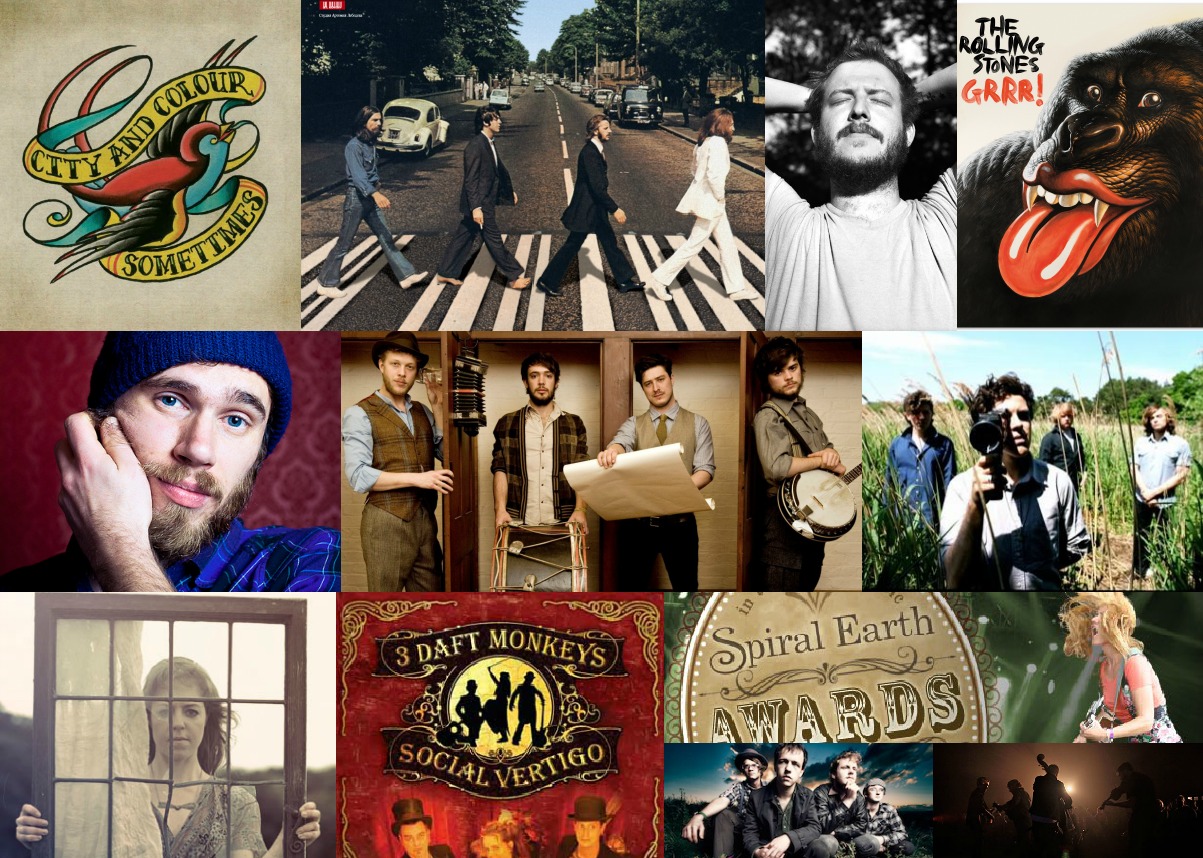
Magazine's which inspired my dps;
Banner

DPS #2


Saturday 19 January 2013


Contents Page - Flat Plans
Whilst producing my contents page I started with one original idea but then slowly changed it into a flat plan. I produced one, and then developed that into an official flat plan.

My first flat plan consisted of the layout, text and pictures I will be using on the contents page. This flat plan is a rough copy as it has been drawn free handedly and no colour has been used.
Contents #1

This is my second and official flat plan which I progressed more and added colours, and drew in photos that I am planning on taking with my photo shoots. Whilst producing my contents page I kept the layout of the information column and the editor’s letter the same I also kept the ‘WIN TICKETS TO THE SPIRAL EARTH AWARDS’I changed the some of the layout from my first flat plan because I wanted more than one picture used in the contents page. I was inspired by the magazine billboard inparticular because of the photo they took of ‘Charice’ kneeling down next to the information aisle. Not only this, but I used the research I done searching for upcoming gigs and festivals and applied that in use for the ‘The Spiral Earth Awards’ Throughout the contents page, and the research I done on others I saw that it was common to use references from the front cover. E.g. the free Calendars I drew on the front cover I again used on the contents page showing the audience where it is in the magazine. 
 Contents #2

Spiral Earth Awards

Billboard Contents (Magazine)


Front Cover - Flat Plan(s)
Whilst producing my front cover I started with one original idea but then slowly progressed it into one official flat plan. I produced two before I made the one my front cover will hopefully turn out to look like.

This being my original plan for the front cover. Yes I admit it looks quite bland, and I had not chosen the name for the magazine whilst producing this particular flat plan. During my flat plan I decided on what I want the front cover's photo to be like; Hence the writing in blue in place of where the picture should've been drawn. This particular flat plan does not have as much detail as my other two it doesn't have colour nor has it been drawn with a ruler.
Front Cover #1

My second flat plan was based around me testing out colours, that I was going to use and where I wanted to place the pull quote(s), stamps etc. I also attempted to draw the picture that I had in my mind for the cover and tried to see if the layout I originally had would work with the layout I produced. In this flatplan I decided upon my magazine's name. FOLK.
Front Cover #2

This is my last and official flat plan for my front cover. I have decided to go ahead with this flat plan because I  very much prefer this layout and colours used in this one to the other two. However there are a few things I think I may change; for example the size of the price at the top of the magazine. I may reduce the size of it just because it is bigger than the actual name of the magazine. My inspiration for the price of this magazine came from the magazine; OK. Just because at the top of the magazine it shows the price and I wanted the price to be placed differently from all the other music magazines. The 'Free Calender' drawn on the right hand side was inspiration from the magazine I used for my focus group. 'Kerrang'. Through my research it became clear to me that the age group I am aiming for teenagers+ do like freebies especially if they're going to pay £2.10 for a folk rock magazine. 
Front Cover #3
 
In conclusion for my flat plan for the front cover I didn't have much stuff to work from considering the low market for folk rock magazines so I had to take inspiration from magazines which do and don't relate to the genre at all.

Magazines which inspired the layout for my front cover.
OK! Price place.
Kerrang - Calender


Flat plans
I have produced three flat plans for my magazine; for the front cover, contents page and the double page spread. I will make three individual posts to show the different flat plans that I have produced for each page. This post will be used to explain my research and inspiration for my folk rock magazine.

The Name
I have chosen a name for my magazine, because whilst producing it I had the thought of what would I name my magazine repeatedly running through my head. So the chosen name for my magazine is FOLK. This being because my chosen genre is folk, and the main inspiration I got for this name would be the magazine; NME because the name is just straight forward and simple. 


The prime reason I chose to make 'FOLK.' the name of my magazine is because when placing it on the front cover it won't cover the main picture or the picture covering the photo; I was aiming for a short name due to what 'Brogan' said in my focus group about how if  she did not know the initial name of the magazine 'Kerrang' she would've assumed the magazine's name was 'Kerra' due to the photo covering it:


During my research for magazines I found that their isn't really a market for folk rock magazines so my inspiration solely came from genres of the rock and alternative genre.


Tuesday 15 January 2013

Discovering more Folk Rock artists
So I was going through my music library, and was listening to a few well known artists and hearing elements of folk rock intwined in their songs. I researched on this finding out what genre they base around and I was surprised to find that some of these artists are actual folk artists. Two which surprised me the most where Johnny Flynn and Kate Walsh. 

Flatplan...(Deadline 22nd January)
This week we will be planning our flatpans and what it is that we must use during our production. In today's lesson, we went through the mark scheme and  some examples from the past year showing us the dos and don'ts of producing a magazine.
  • It must be detailed as possible with text and colour completeled.
  • It should show how my research has influence me.
  • It should include a minimun of four images.
  • My finished magazine should be recognizable to your flatplan.
  • The design of the magazine/ flatplan will change and progress but I must always explain and justify why it is that these changes have taken place.
So I will be now working on my flatplans and using my research on magazine covers, contents and dps to gain some of my own inspiration to use towards my own. Wish me luck! ^__^


Monday 14 January 2013

Market Research Qualitative Analysis
Front Cover
"You don't normally associate Yellow and Red with dark dull colours, it's usually connected to vibrant, pow bright in your face colours. The contrast really works" - Brogan
I was going over the colours that I was thinking of using for my front cover on my magazine and I was wondering how it is I'd be able to show contrast of colours through my folk rock front cover. As Brogan spoke about the colours 'Yellow and Red' not normally being associated with colours such as black and grey. I am going to aim to use the colours in a manner where the background is dull with titles/stamps being bright.
"Picture over the text, as it makes the front cover look more dramatic" - Najda
When taking pictures for my front cover, I am going to aim and try to make my artist express himself through the pictures I take. For example, I may take pictures of him performing; show the passion he has for music etc.
"If you were to put your artist over the name of the magazine, you'd have to position it in a manner where the reader is able to see the name as well. So faded but still seen." - Ruby
When choosing the name of the magazine/ setting the model I wasn't planning on covering the name of the magazine with the model. 
Contents Page
"On the front cover it has 'free' posters, so as soon as you're on the contents page you are able to see where it is that the posters are." - Ruby
When using photos on my front cover, in my contents page I will be referencing from photo used on the front cover to where to find that particular article/ poster. 
"Waste of time, no-one really cares about them" - Brogan (Editors Letter)
I originally was aiming to put an editors letter on the contents page, but my target audience seemed to dislike the idea. However, I may do a small collage of the team behind the magazine build up.
Double Page Spread
"It looks more like a newspaper article, more than a magazine. A magazine doesn't have that much in depth writing." - Brogan
When producing the double page spread, I will have to bare in mind that the questions I ask will have to be in depth but short. So the reader doesn't get bored, but has an interview which enables them to get to know the artist more.
"It's the effort behind how the picture's taken" - Najda
When taking any picture I will constantly have to think about the mis-en-scene and whether it all connects as it will be the main thing that will attract my audience and want them to even think about reading the article.

Sunday 13 January 2013

Reader Profiles...
Leah - 16
  • This is Leah; she is a 16 years young and enjoys every genre of music. 
  • Leah is currently sitting mocks for her GCSE's.
  • Leah takes Music, Media, Art and Drama as well as the recommended subjects at GSCE.
  • Leah's favourite genre of music is folk rock
  • Leah's favourite band are Dry The River
  • Leah has met Dry The River three times.
  • Dry the river are very aware of who she is.
  • Leah collects Kerrang magazine as she enjoys the free calenders/ CD's.
  • Leah's favourite colour is green
  • I asked Leah to define her life in one word. She responded with 'Music'
Likes
  • Music
  • Food
  • Friends
  • Parties
  • Books
Dislikes
  • Silence
  • Restriction
  • Judgement 
Luke - 18
  • This is Luke who is 18 years young and loves Rock.
  • Luke is currently sitting his a-level exams and in the last year of college.
  • Luke takes 3 A-levels; Music, History and English.
  • Luke's favourite genre of music is Folk Rock but loves all the sub genres of Rock ing general.
  • Luke's favourite band are The Beatles.
  • Luke's favourite colour is grey.
  • Luke collects Classic Rock magazines as he prefers the old Rock to what it has become now.
  • Luke's ipod is full of bands ranging from The Rolling Stones to City and Colour
  • Luke prefers the lyrics which tell a story and have meaning, rather than those which are showing off.
  • Luke enjoys attending gigs so he keeps an eye out for anyone upcoming gigs.
Likes 
  • Music
  • Friends
  • Internet
  • Harry Potter
  • Bands
Dislikes

  • Biased people.
Mood board for folk rock
I have produced a mood board for my chosen genre Folk Rock. The reason I produced this is because I think it's essential that I have an idea of what colours/photos I should use/take when I begin taking photos/ and choosing a colour for my magazine cover, contents and DPS. I used a combination of photo shoots of folk rock artists, their album covers and a few leaflets promoting folk rock gigs/ award shows. The reason I used these particular photos is because I wanted inspiration more from the artist rather than Magazine covers so I can produce the colour scheme myself. Not only that but there aren't many Folk Rock magazines so everything I produce will be completely unique. 


Friday 11 January 2013

Market Research Quantative Analysis
Front Cover
From my market research online one of my questions were "When looking for a magazine what is it that captures your attention first?" I gave them eight choices as my question was a multiple choice answer they had the choice of colour, image, graphics, pull quotes, headlines, exclusives, freebies (cd's calenders etc) or the price. 18 people have answered my questionnaire and so far the highest answer has been 'Image' this tells  me that when planning/considering the photo for the front cover of my magazine I will have to make sure that it's appealing to the particular audience that I am aiming for which are 17+


Again the question here asked was based around the front cover; "One block picture as the front cover or a multiple of them?" The highest was a block picture. So again with my audience being 17+ I will have to make sure that the main picture used appeals not only to them but those of an older age too.


Contents Page
With the contents page the question asked was "When reading the contents page would it is useful to have a few sentences which tell you what each of the features are?" The question again was a multiple choice and so they responded with 'yes' I originally planned on giving the reader an insight on the contents page of what each feature based around. So this is something I will for certain be using.


Double Page Spread
For my double page spread market research I asked "When viewing a double page spread do you prefer a dominant picture or more text?" again this was a multiple choice question and they answered with 'picture' being the highest. I'm planning on making my DPS mainly picture; so you can see the energy and love that the artist has for the music. Constantly thinking the misenscene.


In conclusion from all the market research I have done I have learnt that the image is the most important thing and that when I take my own pictures I will keep in mind that the pictures I take will be the essence of my magazine.

Thursday 10 January 2013

Today I recorded three people as my focus group talking about the layout of the magazine; Kerrang. Focussing on the front cover, contents page and their double page spread. Throughout the video I asked them all questions based around the front cover, contents and DPS asking their opinions on the colour used and the images. Whether this is the kind of magazine they would read, who they think this magazine is aimed at etc.
Front Cover

Video:

Part 1

Part 2

Wednesday 9 January 2013

Tomorrow I will be hosting a focus group asking three people hopefully 25 questions in the space of 10 minutes. I have already asked their permission to record them and upload it to my blog. None of them are bothered by this fact so I will keep my blog updated on how it turns out and upload the video by Friday.
I have finished my questionnaires and have uploaded and distributed them online to my twitter feed. This allowing people from across the world to answer my three questions based around magazines; front cover, contents page and a double page spread.

Front Cover - http://www.surveymonkey.com/s/CMSHPY5
Contents Page - http://www.surveymonkey.com/s/CXP5XDD
Double Page Spread - http://www.surveymonkey.com/s/CNNPCR8

I am currently producing questions for my questionnaire that I will used online with the website; surveymonkey. I have just finished making the questions and will now add them to my account on surverymonkey. 


Tuesday 8 January 2013

A presentation I have produced for what it is I have learnt whilst researching upon Folk Rock.

Sunday 6 January 2013

In my recent post I spoke about asking my friend Toby if he'd help me with my media coursework; he responded with an enthusiastic yes and is now my chosen artist for my magazine. What’s even more helpful about using Toby as my chosen artist is that the genre he has chosen to go into is Folk Rock my chosen genre.


Friday 4 January 2013

What Is Folk Rock?
Folk Rock is basically what the name states it is a mixture of Folk and Rock. The genre arose during the 1960's through the U.S.A and U.K. Lead by the Los Angela's band; The Byrds. Their music was unique because they were the first to combine folk and rock together thus creating Folk Rock. Most of their inspiration coming from British based bands such as The Beatles, Rolling Stones etc.

The Byrds

The Beatles

The Rolling Stones

Here is a collage I produced myself; made up of popular/ well known folk rock artists

My chosen genre is Folk Rock and so whilst researching artists I not only produced a wordle but found a website which gave me information on upcoming gigs/festivals. The reason I produced a wordle is so that I show the variety of artists within the genre of folk rock. Many believe that folk rock is not an important or popular genre however bands such as 'The Beatles' and 'The Rolling Stones' have both been popular for  more than a century. Then artists such as Maia and Mumford and Sons are recent upcoming artists who have  been popularised through social media, radio stations and music channels. Web 2.0 has now taken place and  has now turned music more digital; which then allows a person to listen/ broaden their music taste. Websites such as spotify and youtube allow you to listen to music but also give you recommendations because of a song you have listened to thus broadening your music knowledge. 

 Wordle

Gigs/Festivals